

First, the classic smooth line. Craig once posted this on Bogleheads.

The PP is greater than the sum of its parts, and one should not judge any one asset in isolation.
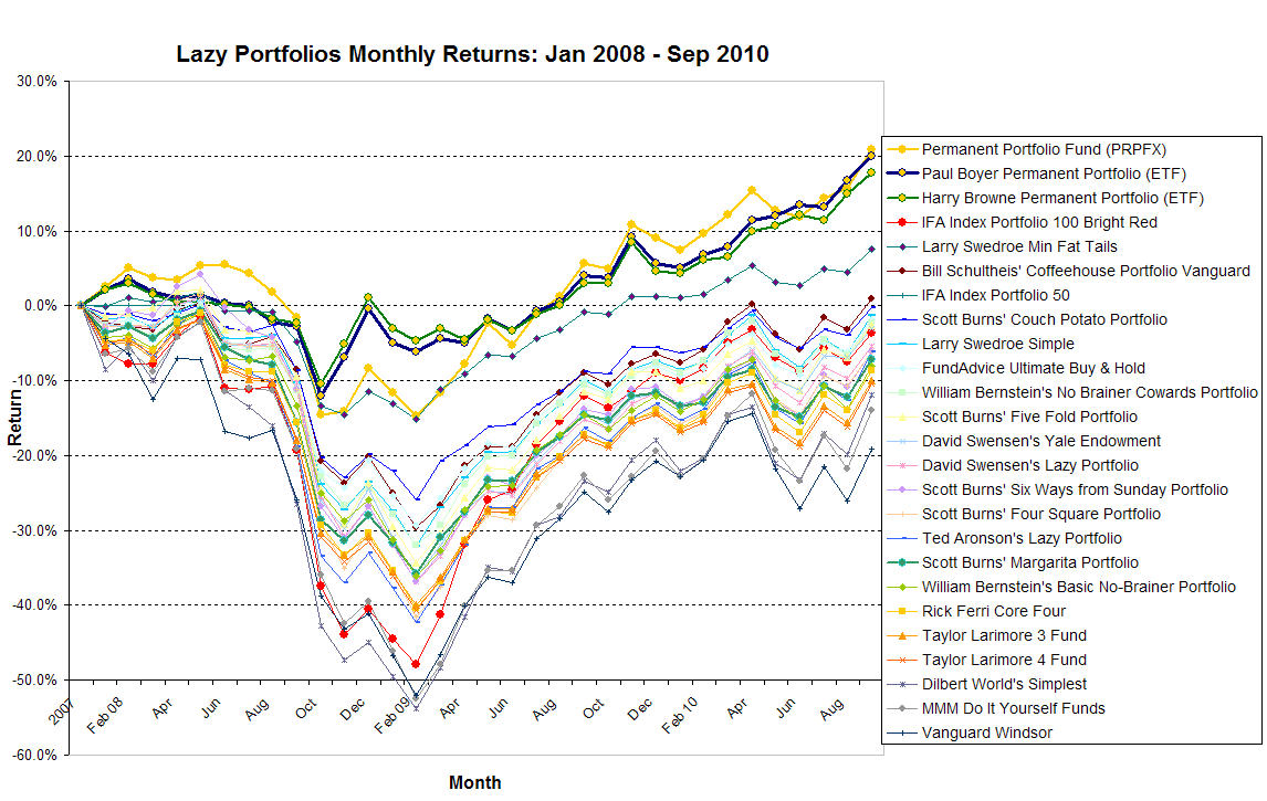
Next, a good perspective of PP performance history:


If you're curious, RickB showed here (http://gyroscopicinvesting.com/forum/pe ... c-graphic/) that a 60/40 Boglehead AA looks a lot like the stock chart but a bit more muted. The PP just does its thing, generating a 3-7% annualized real return over all rolling 10-year investment periods. That doesn't mean there isn't the occasional period of 2-3 years with small negative compound returns, but things historically average out much more quickly than in stock-heavy portfolios. For reference, the CAGR for the last 3 years would be a light pink cell on the chart. Nothing unusual, nothing to fear.
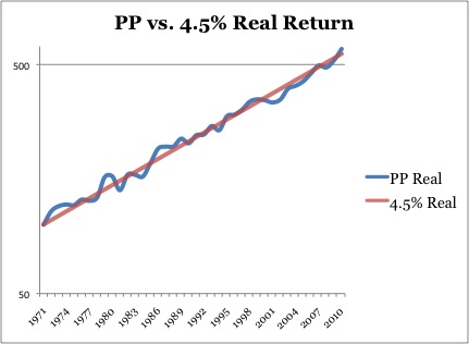
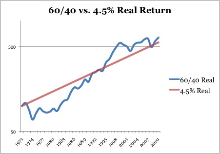
For those concerned about real returns versus the more popular 60/40 Boglehead portfolio, here are two fantastic charts from Melveyr's website (http://www.stableinvesting.com/2011/04/ ... hmark.html)
One should not allow recency bias in the stock market to affect their historical perspective. The PP is amazingly consistent over time.
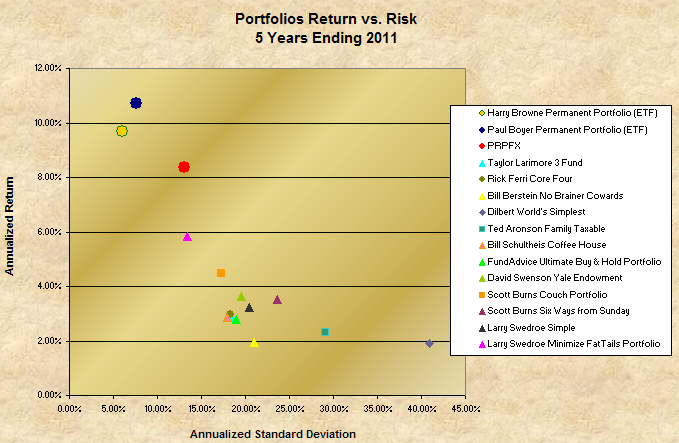
And for retirees, this one is pretty handy:

Contemplate for a while why, if there was a recent 20-year period that supported 8%+ inflation-adjusted withdrawal rates, the standard advice is to withdraw only 4% from a stock/bond portfolio. It's because when the returns do go bad, they can go negative for more than a decade on an annualized basis (also refer to the previous heat maps). Those are times that will stress even the most experienced investors. The PP is nice and consistent, allowing you to enjoy your retirement without all of the associated mood swings.
The Permanent Portfolio may not be for everyone, but the more I look at images like these the more I realize it's for me.
{edit for image size}


