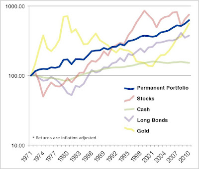
Hey guys. I made a chart of the PP that you all might find interesting. It uses annual returns, and the returns were taken from simbas spreadsheet. I took these returns, put them in a new spreadsheet and adjusted for inflation.
I like the chart because it shows you the power of the low correlations, and the insanity of investing in only one asset class.
everything comes from somewhere and everything goes somewhere
A couple of months ago I put together a similar chart with monthly data adjusted for inflation and reinvestment of dividends. I'll update it again in a few weeks once the BLS releases the March numbers.
Last edited by Gumby on Thu Mar 10, 2011 8:16 pm, edited 1 time in total.
Nothing I say should be construed as advice or expertise. I am only sharing opinions which may or may not be applicable in any given case.
Thank you both for these charts which are highly informative. A small request: would it be possible to publish the charts with detailed scales on the axes? It's particularly difficult to interpolate in the logarithmic scale to get additional data points.
The length of the comparison will impact the results.
When I go to Yahoo Finance and compare PRPFX with SPY on the interactive chart, for example, I discover SPY outperforms PRPFX over the last two years, but PRPFX outperforms SPY over the last five years. Other time frames could be analyzed also.
The advantage PRPFX has over SPY is that PRPFX is less volatile (which I see as an advantage for certain parts of my portfolio, especially during my wealth harvesting years). But the advantage SPY has over PRPFX is that SPY can really outperform PRPFX if I happen to get lucky during my wealth accumulation years and find myself in an equities bull market.
Financial Freedom --> Time Freedom --> Lifestyle Freedom
nic wrote:A small request: would it be possible to publish the charts with detailed scales on the axes? It's particularly difficult to interpolate in the logarithmic scale to get additional data points.
It's just not how it's done. Long term comparison charts should really always be shown on a logarithmic scale since equal vertical distances anywhere in the chart represent equal percentage changes in return. The callouts on my chart should help decipher the precise differences.
Nothing I say should be construed as advice or expertise. I am only sharing opinions which may or may not be applicable in any given case.
nic wrote:A small request: would it be possible to publish the charts with detailed scales on the axes? It's particularly difficult to interpolate in the logarithmic scale to get additional data points.
It's just not how it's done. Long term comparison charts should really always be shown on a logarithmic scale since equal vertical distances anywhere in the chart represent equal percentage changes in return. The callouts on my chart should help decipher the precise differences.
I didn't mean to suggest using a linear or some other scale. My problem occurs in trying to figure out, say, the portfolio value corresponding to the value 2005 on the x axis. I look on the y axis and have very little idea of the portfolio value because there is no indicator between $100 and $1000. One small suggestion would be to put 4 or 5 equally spaced tick marks between each pair of numbers on the axis. Then, with 4 ticks each would correspond to multiplying by 10^(.25) ~ 1.77... I would then know that each tick corresponded to a factor of roughly 7/4 and would not have to so much guessing of the value.
I've said it before but it's worth saying again: thanks so much for your chart. On first seeing it I thought "why bother with the PP - why not just buy and hold the S&P500 through thick and thin and come out about 33% ahead?" The S&P500 has been ahead for a continuous period of over 20 years after all. For other people with the same question: one answer is about needing money in a down period and another is that if you take the S&P approach today how can you be sure that the next period won't look like the period prior to 1990?
longeyes wrote:
Then again you can use the PP and have the S&P500 or something similar as a "kicker" in your VP for times when there's a clear prosperity boom.
You mean like in 2000 and 2007 haha!
Well it always seems to comes back to good timing....
nic wrote:My problem occurs in trying to figure out, say, the portfolio value corresponding to the value 2005 on the x axis. I look on the y axis and have very little idea of the portfolio value because there is no indicator between $100 and $1000. One small suggestion would be to put 4 or 5 equally spaced tick marks between each pair of numbers on the axis. Then, with 4 ticks each would correspond to multiplying by 10^(.25) ~ 1.77... I would then know that each tick corresponded to a factor of roughly 7/4 and would not have to so much guessing of the value.
I see what you mean. You can peek at the raw data if you want. See the following thread:
I wouldn't get too bogged down on the exact values for each data point. This is just one example of the Permanent Portfolio that just happened to start on January 1 1970. The results are slightly different for everyone.
nic wrote:On first seeing it I thought "why bother with the PP - why not just buy and hold the S&P500 through thick and thin and come out about 33% ahead?" The S&P500 has been ahead for a continuous period of over 20 years after all. For other people with the same question: one answer is about needing money in a down period and another is that if you take the S&P approach today how can you be sure that the next period won't look like the period prior to 1990?
I think the lower volatility is, in some ways, more important than the specific return. When you lower your volatility, it's much easier to stick to your investment plan. You may get a better return with stocks but you need nerves of steel to achieve that higher return. It's not realistic. I think many people don't realize just how important low volatility is until a crisis happens.
Last edited by Gumby on Sat Mar 19, 2011 12:25 pm, edited 1 time in total.
Nothing I say should be construed as advice or expertise. I am only sharing opinions which may or may not be applicable in any given case.