What a difference a day makes...
Moderator: Global Moderator
What a difference a day makes...
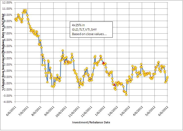
One's satisfaction with the returns of a conventional 4x25 HBPP (GLD,VTI,TLT,SHY) during the past year appears to depend quite a bit on when you started or rebalanced your PP. The plot below shows the returns from 6/6/11 thru 6/6/12 depending on what day you started. For me, I made one investment on 1/4/12 that currently (as of 6/6) shows over a 2% return while a second investment I made days later (1/30/12) shows about 1% return thus far (see red triangles).
Re: What a difference a day makes...
Ha, February 19-27 2012 was when I started moving assets in. Currently -.15%. I guess that means I'm doing better than I should be.

Re: What a difference a day makes...
Yeah, those of us that were in before the debt ceiling fiasco had a great year, while those that got in afterwards have pretty much been treading water. I don't expect this flat trend to continue. The market will either break towards recession or growth sometime soon.
"I came here for financial advice, but I've ended up with a bunch of shave soaps and apparently am about to start eating sardines. Not that I'm complaining, of course." -ZedThou
-
Pointedstick

- Executive Member

- Posts: 8886
- Joined: Tue Apr 17, 2012 9:21 pm
- Contact:
Re: What a difference a day makes...
At the very least, I'm sure there will be another debt ceiling fiasco this year!Storm wrote: Yeah, those of us that were in before the debt ceiling fiasco had a great year, while those that got in afterwards have pretty much been treading water. I don't expect this flat trend to continue. The market will either break towards recession or growth sometime soon.
Human behavior is economic behavior. The particulars may vary, but competition for limited resources remains a constant.
- CEO Nwabudike Morgan
- CEO Nwabudike Morgan


Re: What a difference a day makes...
But certainly the PP has been keeping its low volatility promise. The components go shooting off in random directions day-to-day, and for the most part it all averages out, even on any given day.
Re: What a difference a day makes...
I'd argue that the graph is flawed if what you are depicting is the nominal return between the date listed on the X-axis and 6/6/12. I'll give you an example that outlines the fault in this logic.
Suppose in your example you run from Jan 1st until Dec 31st of the same year and create the same graph.
An investor who put their money in the PP on Jan 1st has a 10% return whereas someone who put their money in on June 1st has a 6% return. By this logic, the person who invested on Jan 1 is the "winner" because he got 4% more than the person who invested on June 1.
However, if you look at annualized returns, the person who put money on June 1st actually got a 12% annualized return because he earned that 6% over the course of 6 months.
Another way to reveal the fault in the logic is imagine you stretch the X-axis backwards by 30 years. The person who invested money in Jan 1st of 1970 might have a 500%+ return, which is meaningless in depicting what the intent of this graph is supposed to be.
Thus, of course your graph is sloping down over time, because we expect a person with less time in the PP to have a lower return. If you want the graph to be meaningful, then you need to annualize the returns that you list on the y-axis.
Doing this would actually paint a scarier graph because it shows someone investing 3 months ago has lost about 3%. That's a 12% annualized loss. Of course that's ridiculous because then someone investing in the PP yesterday who lost 1%, would then demonstrate a 365% annualized loss, extrapolated out.
I'm not sure there's a good way to depict this data in a way that makes sense visually without skewing the situation. Perhaps keeping the data listed exactly as you have it, but then also adding a downward sloping line from the starting point (x-axis = 0, y-axis = your first % gain), with the slope of the line to be -(1/365) so that this line depicts what you would expect the nominal return to be at any time point if the annualized return at that time is equal to the annualized return at the starting point. [Basically draw a downward sloping straight line to start at point (6/6/11, 9%) and end at point (6/6/12, 0%), because expect a near zero return on the last day.]
Then we can visually compare the distance between the actual gain/loss to the expected gain loss. You'd have to draw one of these lines with the starting point on each day, because then you want to know "If I started on Day X, how does it compare to starting on Day Y" you would have to compare the "line" that originates on Day Y (running to present day) to the point on Day X. If the point on Day X is above the line, we know you were better off starting on Day X. If the point is below the line, you were better off starting on Day Y.
It would make the graph really complex to show a few hundred straight lines, one starting on each market open day, so perhaps limit it to one line per month, or one line every 2 months.
Last edited by TripleB on Wed Jun 27, 2012 9:10 am, edited 1 time in total.
Re: What a difference a day makes...
TripleB
Good observations! You are exactly correct to point out the all the graph conveys is the %change in value from the investment/rebalance date to 6/6/12 and that it in no way conveys an annualized value.
All I was trying to show is the different perspective of how one might feel when looking at one's portfolio value vs another who started only a matter of days before/after you did...
It also points out that daily reflections will drive you batty...
Re: What a difference a day makes...
Perhaps another idea is to show the annualized return (to today) as a function of start date, but simply omit the last 6 months from the graph since less than 6 months is not enough time for this metric to be meaningful. I track rolling monthly 12 month returns which is a similar sort of idea (rolling rather than cumulative). Starting with end of May 2012 and working backwards the data I have shows the following - assuming 25% each VTI/TLT/SHY/GLD, rebalanced monthly, dividends included, "frictionless" (no taxes and no trading costs):TripleB wrote: I'd argue that the graph is flawed if what you are depicting is the nominal return between the date listed on the X-axis and 6/6/12. I'll give you an example that outlines the fault in this logic.
Suppose in your example you run from Jan 1st until Dec 31st of the same year and create the same graph.
An investor who put their money in the PP on Jan 1st has a 10% return whereas someone who put their money in on June 1st has a 6% return. By this logic, the person who invested on Jan 1 is the "winner" because he got 4% more than the person who invested on June 1.
However, if you look at annualized returns, the person who put money on June 1st actually got a 12% annualized return because he earned that 6% over the course of 6 months.
Another way to reveal the fault in the logic is imagine you stretch the X-axis backwards by 30 years. The person who invested money in Jan 1st of 1970 might have a 500%+ return, which is meaningless in depicting what the intent of this graph is supposed to be.
Thus, of course your graph is sloping down over time, because we expect a person with less time in the PP to have a lower return. If you want the graph to be meaningful, then you need to annualize the returns that you list on the y-axis.
Doing this would actually paint a scarier graph because it shows someone investing 3 months ago has lost about 3%. That's a 12% annualized loss. Of course that's ridiculous because then someone investing in the PP yesterday who lost 1%, would then demonstrate a 365% annualized loss, extrapolated out.
I'm not sure there's a good way to depict this data in a way that makes sense visually without skewing the situation. Perhaps keeping the data listed exactly as you have it, but then also adding a downward sloping line from the starting point (x-axis = 0, y-axis = your first % gain), with the slope of the line to be -(1/365) so that this line depicts what you would expect the nominal return to be at any time point if the annualized return at that time is equal to the annualized return at the starting point. [Basically draw a downward sloping straight line to start at point (6/6/11, 9%) and end at point (6/6/12, 0%), because expect a near zero return on the last day.]
Then we can visually compare the distance between the actual gain/loss to the expected gain loss. You'd have to draw one of these lines with the starting point on each day, because then you want to know "If I started on Day X, how does it compare to starting on Day Y" you would have to compare the "line" that originates on Day Y (running to present day) to the point on Day X. If the point on Day X is above the line, we know you were better off starting on Day X. If the point is below the line, you were better off starting on Day Y.
It would make the graph really complex to show a few hundred straight lines, one starting on each market open day, so perhaps limit it to one line per month, or one line every 2 months.
MayAprilMarchFebJan
9.07%9.87%12.53%14.04%17.97%
Dec 11NovOctSept AugJul
11.32%14.36%13.59%11.04%17.19%15.18%
June 11MayAprilMarchFebJan
12.46%14.53%14.46%13.51%14.02%12.19%
Dec 10NovOctSept AugJul
14.36%9.16%14.46%12.98%13.15%12.03%
Re: What a difference a day makes...
I find doing a regression on the data and calculating returns on the regressed line makes the results a little less sensitive to the starting date. Unfortunately some mutual funds pick dates to show the best returns. Starting on a day when the market when down and ending on a day when it went up makes the results look better than they actually are.
Re: What a difference a day makes...
If you look at my "girlfriend satisfaction rating" between March 6th 2012 to date, it's incredible! If we exclude the 3 worst performing days of the year:gap wrote: Unfortunately some mutual funds pick dates to show the best returns. Starting on a day when the market when down and ending on a day when it went up makes the results look better than they actually are.
1) When I neglected to point out her new haircut
2) When I implied that she's fat by not directly telling her she looked skinny
3) When I left her at home to go out with my guy friends
Then my performance YTD is stellar! It's all just a matter of when you start measuring from

Re: What a difference a day makes...
And if someone looked at the history of all of your girlfriends and backed out the worst three or four it would probably make it appear as if you were more skilled at finding and maintaining love than you really are.TripleB wrote:If you look at my "girlfriend satisfaction rating" between March 6th 2012 to date, it's incredible! If we exclude the 3 worst performing days of the year:gap wrote: Unfortunately some mutual funds pick dates to show the best returns. Starting on a day when the market when down and ending on a day when it went up makes the results look better than they actually are.
1) When I neglected to point out her new haircut
2) When I implied that she's fat by not directly telling her she looked skinny
3) When I left her at home to go out with my guy friends
Then my performance YTD is stellar! It's all just a matter of when you start measuring from
While it's true that past performance is no guarantee of future results, I think it's also true that past performance is perhaps not even a guarantee of past performance.
Q: “Do you have funny shaped balloons?”
A: “Not unless round is funny.”
A: “Not unless round is funny.”