Cool Collection of PP Charts
Moderator: Global Moderator


Cool Collection of PP Charts
Below
Q: “Do you have funny shaped balloons?”
A: “Not unless round is funny.”
A: “Not unless round is funny.”

Re: Cool Collection of PP Charts
Fun topic!
Here are a few of my own. All source data is from Simba's spreadsheet. Rebalanced annually.

More info here: http://tinyurl.com/p6hlxts and in RickB's link below


More info here: http://tinyurl.com/q9yq5gb

FYI -- if you find these charts helpful, you can now make your own at PortfolioCharts.com. Enjoy!
Here are a few of my own. All source data is from Simba's spreadsheet. Rebalanced annually.
More info here: http://tinyurl.com/p6hlxts and in RickB's link below
More info here: http://tinyurl.com/q9yq5gb
FYI -- if you find these charts helpful, you can now make your own at PortfolioCharts.com. Enjoy!
Last edited by Tyler on Sun Jun 05, 2016 11:47 am, edited 3 times in total.
Re: Cool Collection of PP Charts
[Original thread: http://gyroscopicinvesting.com/forum/pe ... c-graphic/]
Apologies to those of you who are red/green colorblind - in this chart of the inflation adjusted CAGR (similar to Tyler's above - and the original must be credited http://www.crestmontresearch.com/stock-matrix-options/) the color intensity varies essentially continuously according to the magnitude of the CAGR - i.e. there aren't just 5 discrete colors but rather a continuous range of colors. There's a discrete red/green shift at 3% CAGR, but other than that the "brightness" of the red or green reflects the magnitude of the CAGR. In all cases the CAGR is inflation adjusted, based on yearly data, with annual rebalancing, and does not account for fees or taxes.
Permanent Portfolio:

100% stock:

60/40 stock / 10yr treasuries:

Apologies to those of you who are red/green colorblind - in this chart of the inflation adjusted CAGR (similar to Tyler's above - and the original must be credited http://www.crestmontresearch.com/stock-matrix-options/) the color intensity varies essentially continuously according to the magnitude of the CAGR - i.e. there aren't just 5 discrete colors but rather a continuous range of colors. There's a discrete red/green shift at 3% CAGR, but other than that the "brightness" of the red or green reflects the magnitude of the CAGR. In all cases the CAGR is inflation adjusted, based on yearly data, with annual rebalancing, and does not account for fees or taxes.
Permanent Portfolio:
100% stock:
60/40 stock / 10yr treasuries:
Last edited by rickb on Sun Jun 28, 2015 1:37 am, edited 1 time in total.
Re: Cool Collection of PP Charts
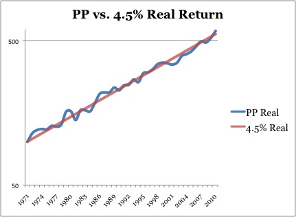
Good chart but it looks like it ends in 2011...any chance of an updated version out to 2014 or (so far) 2015? I know the last few years haven't been exactly stunning for the PP and I wanted to see if it was still at the trendline or below it.Tyler wrote: Another favorite of mine is from Ryan Melvey (melveyr).
More info here: http://tinyurl.com/otuojkc
-
Mark Leavy

- Executive Member

- Posts: 1950
- Joined: Thu Mar 01, 2012 10:20 pm
- Location: US Citizen, Permanent Traveler
Re: Cool Collection of PP Charts
Here's the last 11 years (05/26/04 to 06/30/15)D1984 wrote: Good chart but it looks like it ends in 2011...any chance of an updated version out to 2014 or (so far) 2015? I know the last few years haven't been exactly stunning for the PP and I wanted to see if it was still at the trendline or below it.
Real Log chart roughly similar to Melvyr's $10K start, 15/25/35 bands.

Nominal and real and assets and rebalances in linear form.

CAGR and Draw Down Info

Best fit of the inflation adjusted data to log growth curve.

-
Pointedstick

- Executive Member
- Posts: 8886
- Joined: Tue Apr 17, 2012 9:21 pm
- Contact:
Re: Cool Collection of PP Charts
[cross-posted from http://gyroscopicinvesting.com/forum/pe ... #msg124921]
Most other portfolios inflate their returns by not having any cash, but in real life nobody holds no cash; they simply don't count it as part of their investment portfolio. As a result, their investment portfolios are a smaller percentage of their net worth than a PP investor would have. So an apples-to-apples comparison of two people with identical net worths, one in the PP, and the other not, would either show that the PP person should have a higher amount of their money in the portfolio, or that the other portfolio should include all that cash off to the side.
25% of total net worth being cash works out to 6.25 years living expenses, which is pretty reasonable. If we modify many conventional portfolios to have that much cash, the actual returns on the total portfolio value become much more comparable to the PP. For example, here's a standard 60/40 portfolio that's been modified to be 25% cash 75% 60/40. In other words, 25% cash, 45% stocks, 30% total bond market. PP in blue, other portfolio in red:
[img width=600]http://i.imgur.com/9mNlCGa.png[/img]
The PP wins!
So no, you don't need a separate cash emergency fund if you invest with the PP.
Human behavior is economic behavior. The particulars may vary, but competition for limited resources remains a constant.
- CEO Nwabudike Morgan
- CEO Nwabudike Morgan
Re: Cool Collection of PP Charts

Last edited by Tyler on Thu Jun 02, 2016 9:28 pm, edited 2 times in total.

Re: Cool Collection of PP Charts
I just happen to have some charts of my own I created a while back. The first is the source data, and the rest are graphs based off of that data. That last one concerns me, as the 43-year Total Return trend line is clearly sloping downward. Enjoy.


Last edited by rocketdog on Thu Sep 17, 2015 12:57 pm, edited 1 time in total.
The whole aim of practical politics is to keep the populace alarmed (and hence clamorous to be led to safety) by menacing it with an endless series of hobgoblins, all of them imaginary.
- H. L. Mencken
- H. L. Mencken

Re: Cool Collection of PP Charts
I've added this linked thread for people to make comments in instead of writing their comments in this thread. Moderators if you'd want to sticky the other thread for comments, be my guest. You are the masters here.
Cool Chart Commentary
Cool Chart Commentary
Last edited by Greg on Wed Dec 09, 2015 7:21 pm, edited 1 time in total.
Background: Mechanical Engineering, Robotics, Control Systems, CAD Modeling, Machining, Wearable Exoskeletons, Applied Physiology, Drawing (Pencil/Charcoal), Drums, Guitar/Bass, Piano, Flute
"you are not disabled by your disabilities but rather, abled by your abilities." -Oscar Pistorius
"you are not disabled by your disabilities but rather, abled by your abilities." -Oscar Pistorius
Re: Cool Collection of PP Charts
Here's a new batch including 2015 data:


Last edited by Tyler on Thu Jun 02, 2016 9:28 pm, edited 2 times in total.
Re: Cool Collection of PP Charts

Last edited by Tyler on Thu Jun 02, 2016 9:29 pm, edited 1 time in total.

Re: Cool Collection of PP Charts
I think this chart sums up the appeal of the Permanent Portfolio pretty well:

For comparison:

For more info, read this.
For comparison:
For more info, read this.
-
Mark Leavy
- Executive Member
- Posts: 1950
- Joined: Thu Mar 01, 2012 10:20 pm
- Location: US Citizen, Permanent Traveler
Re: Cool Collection of PP Charts
Just a note to thank Tyler again for the great resource that is Portfolio Charts.
I especially appreciate the risk/return graph. Allowing the user to select his/her own preferred metric for risk and his/her own preferred metric for reward is brilliant.
My choices are maximum drawdown time for risk and maximum perpetual withdrawal for reward.
Your milage might vary.
And Tyler doesn't limit portfolio allocations to 100%. So you can play around with leveraged positions by over-specifying the allocations.
Pretty fun - and seriously one of the best resources available for running "what if" scenarios.
Thank you, Tyler.
Mark
Re: Cool Collection of PP Charts
You're welcome!
As I've said many times and am happy to repeat, I've learned a ton over the years from this forum. Conversations here directly inspired many of the tools on the site, so I'm glad you find them useful.
BTW, it's a shame that Tinypic went under and sank all of the images in this thread along with it. But anyone looking for cool Permanent Portfolio charts can find all the latest data here: https://portfoliocharts.com/portfolio/p ... portfolio/